
Your logo serves as the face of your brand, making appearances on your website, products, marketing materials, in-store signage, and various touchpoints where individuals engage with your brand. While it may appear to be a small visual element, it carries significant weight. Embedded within your logo are essential components, including your brand’s values, product identity, target audience, industry relevance, historical context, and overall personality
Understanding the Basics: What Makes a Good Company Logo?
There’s no such thing as a perfect logo. Goalposts vary depending on your industry, your audience, and your brand values. However, when you’re learning how to design your logo, there are industry-agnostic rules.
Make Sure Your Logo Design Is:
Simple: Avoid all-singing, all-dancing logos with tons of color and tiny details. An overwhelming logo can put people off and ruin a first impression.
Memorable: Your logo is often the first thing people will see. Make sure it’s memorable by using stand-out colors and an eye-catching design.
Relevant: Your logo should reflect your brand personality and values. For example, you should avoid childlike fonts for a serious law firm.
Timeless: It’s tempting to jump on logo trends, but doing this will make your brand identity look dated. Keep your logo timeless so you don’t have to redesign it every couple of years.
Versatile: Your logo will be used in multiple places, from your website and emails to print collateral and packaging. Make sure it’s scalable, works in black and white, and is easy to read on different surfaces.
How to Design a Logo from Scratch
1. Define Your Brand Identity
Brand identity design is a catch-all term for the visual elements of your brand, including your brand colors, your logo, and the way elements of your brand are designed. These visual elements work together to distinguish your brand identity in the minds of your customers.
Your Brand’s Distinguishing Features—What’s Most Important to You and What Will Be Most Recognizable to Your Customers—Lie in the Answers to These Questions. Before Putting Your Pen to Paper, Before Choosing Your Logo Colors and Aesthetics, Ask Yourself Who You Are.
Here Are Steps You Can Take to Nail Your Brand Identity:
- Create a mind map of your brand values: Start with a central idea and diagram your thoughts by connecting keywords and related concepts.
- Reflect on your “why”: Ask yourself why you started your business, what values are important to your brand, and what sets you apart from the competition.
- Come together: Join forces with your team to go over your mind map and values. It helps to get a second (and third) opinion and identify patterns.
- Start conceptualizing: You don’t need to come up with a polished logo straight away. This activity can get your creative juices flowing so you can start to visualize the perfect logo.
2. Seek Inspiration
Getting started is often the hardest part of any creative activity. It’s good to have an idea, but sometimes the problem is having too many ideas at once. It can help to see what other brands are doing and get a feel for the kind of logos you like best.
Here Are Some Places to Get Inspiration:
- Logo repositories: Browse logo libraries like Logoed, Logospire, and Logo Design Love. Create a file of your favorites.
- Check out the competition: What are similar brands doing with their logos? It can help to see if there’s a common theme in your industry.
- Hashtags: Scroll design-related hashtags on Instagram. Try #logo, #logodesigns, and #logodesigner to get started.
3. Determine Logo Style
The style of your own logo should go hand-in-hand with the overall feel of your brand. It helps to think about what kind of experience you want customers to have: Do you want them to feel nostalgic? Relaxed? Inspired? Warm and cozy?
Here Are Some Design Aesthetics You Can Use in Your Logo:
- Classic: Classic logos stand the test of time. They bypass trends and help you reach a broader audience. The colors are usually simple and elegant, which makes your business appear reliable and professional.
- Vintage: Vintage (or retro) logos inspire a sense of nostalgia. They often feature worn-look text, illustrations, and a muted color palette.
- Modern: Modern logos are fresh and minimalist. They often feature a lot of white space, minimal details, and simple lines, creating a trendy, cool feel around your brand.
- Fun: If your brand sells quirky products to a young audience, consider a fun logo style. They’re characterized by colorful illustrations and unconventional fonts and have a positive feel to them.
- Handmade: Handmade logos insinuate your brand is independent and leans heavily toward handcrafted goods. These logos often feature handwritten fonts, organic shapes, and line-drawn illustrations.
4. Choose a Logo Type
Whether you’re designing your own custom logo from scratch or using a logo template, it’s a good idea to understand the different types of logos.
Monogram Logos: Also known as letter marks, monogram logos are made up of letters, often the brand’s initials. Think NBC, GE, HBO, NASA. Monogram logos are simple but help people remember the company behind the logo.
Wordmarks: A wordmark logo (or logotype) is a font-based logo that shows the company name. Think Visa, Disney, and Jeep.
Pictorial Marks: Pictorial marks are graphic-based logos. Whenever you see one, you immediately recognize it as the logo of a company. The Apple fruit logo, Instagram camera logo, and the Target bull’s-eye logo are all examples of this.
Abstract Logo Marks: An abstract logo mark is conceptual. It consists of a symbol that’s made just for your company. Your logo doesn’t relate to anything that exists in the world, like a bird or an apple. It’s designed to express the uniqueness of your brand. Think Airbnb, Microsoft, and Pepsi.
Mascots: A mascot logo represents your business through a character. Often, they are colorful, cartoonish, and fun. A mascot logo humanizes your brand and acts as an ambassador for it.
Combination Marks: A combination mark combines a wordmark or lettermark with a pictorial mark, abstract logo, or mascot. You then integrate them together to create the logo.
5. Decide on a Color Scheme
Color plays an important role in decision-making. One study showed that up to 90% of purchasing decisions are made based on color alone, while another found color can dramatically impact someone’s mood.
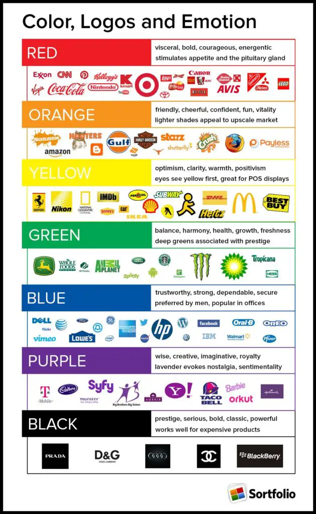
Your Logo’s Colors Will End Up on Your Website, In-Store Signage, Social Media Feeds, Marketing Emails, and Every Other Place Where a User Interacts with Your Brand. There’s No Color That’s Universally “Better,” But Each Color Does Say Something Different. You Want to Make Sure You’re Saying the Right Thing.
With That in Mind, Let’s Go Over the Psychological Effects of Certain Colors:
- Brown: Brown is often associated with all-natural ingredients, homemade goods, and freshly baked treats. It’s also the color of tree bark, sticks, autumn leaves, and rich soil, so it can give an outdoorsy aura to your brand.
- Orange: Like a roaring fire, orange radiates warmth, energy, and passion. It also tends to invoke summer—especially when paired with lighter blues and soft greens.
- Yellow: Orange’s high-saturation sister, yellow, also gives off light, energy, and warmth. But if orange’s warmth is a glowing fireplace, yellow’s is the intense heat of a midday sun. It brings fun, positive vibes to your brand.
- Green: Green can invoke an organic aura that brings to mind lush rainforests, eco-awareness, and a sense of calm.
- Pink: Pink is a soft gentle color often associated with femininity. It has broader connotations of kindness, romance, and love.
- Red: Red is bold and unforgiving. It stands out, which is why it’s become such a dependable color in branding. Like pink, red tends to invoke romance. But whereas pink’s romance is tender and gracious, red’s romance is passionate, loud, and carnal.
- Purple: Purple is a shadowy, mysterious stranger with an almost magical magnetism. Given that purple dyes historically have had a reputation for being rare and expensive, there’s no mystery how purple has come to be associated with wealth, excess, mysticism, magic, and indulgence.
- Blue: Blue tends to invoke feelings of trust, ease, and peace. That said, blue has also been shown to be the least appetizing color. Try to avoid it if you’re selling food.
- Black, Gray, and White: Sometimes the best color for your brand is no color at all. Shades of black, white, and gray tend to invoke a sense of calmness, balance, or clarity.
Using Multiple Colors: Most logos are monochromatic. Single colors are easier to coordinate with, and using only one color will simplify your brand’s other graphic design elements. Mono logos also can be reimagined in different colors for different purposes.
6. Pick a Font
Your logo may not include any text, but much of your graphic design will, including your web copy, signage, and a host of other branded materials. For the sake of consistency, it’s important to consider which typefaces your brand plans on using in the logo design process, even if you’re not using them in the logo itself.
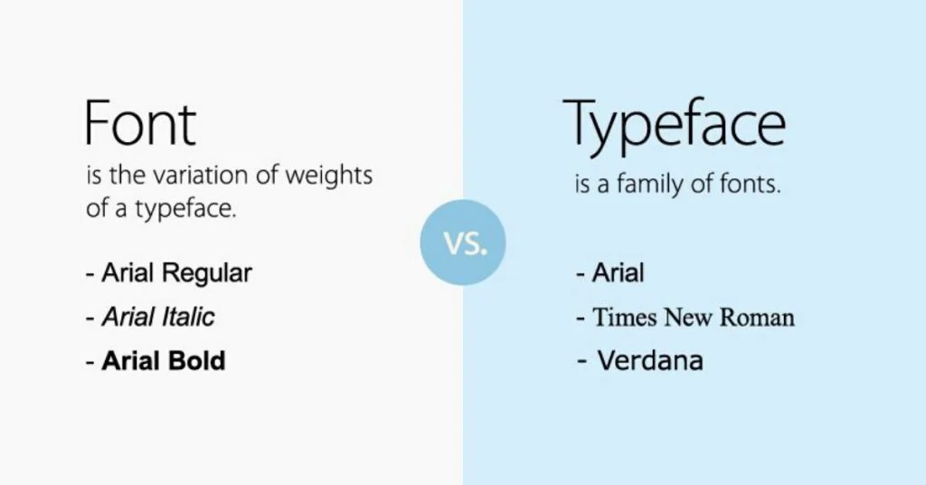
Typeface vs. Font:
The terms “typeface” and “font” are used interchangeably in most contexts, so it’s common to assume they’re synonyms. However, there’s an important distinction: a typeface is a characteristically distinct set of typographical symbols and characters, often divided into variant sets, like italic and bold. Each of these variant sets is a font.
The Four Basic Type Styles and When to Use Them:
Serif Fonts: Serif is the oldest type style and dates back to the Latin alphabet. It’s characterized by the “feet” at the end of each stroke. Serif typefaces are associated with history and tradition and are often used by luxury brands to invoke a sense of elegance.
Sans Serif Fonts: Sans serif type is more modern and often used in a digital capacity because it’s easier to read on a screen. These typefaces are associated with simplicity and minimalism and are often used to convey a sense of innovation and modernity.
Script Fonts: Script typefaces are derived from handwriting or calligraphy. They’re fluid and often used in whimsical contexts to portray a sense of personality, romance, and passion.
Decorative Fonts: Decorative typefaces forego typographical conventions and can take on a wide variety of moods. They are stylistically diverse and should be used sparingly—too much of a good thing can quickly become tacky.
7. Outline a Logo Shape
The shape of your final logo design is just as important as the colors and fonts you use. We subconsciously respond in different ways to different shapes, whether it’s a circle or a square. Here are some common logo shapes and what they might signify:
Circles and Ovals: Anything circular projects a positive message, usually related to community, friendship, and love.
Squares: Squares signify practicality and stability. They also imply balance and strength—but be mindful that they can appear cold and uninviting if paired with a monochrome color palette.
Triangles: Triangles are often associated with science and power and tend to reflect masculine traits.
Vertical and Horizontal Lines: We subconsciously associate vertical lines with strength, while horizontal lines often indicate community and calmness.
8. Fine-Tune Your Logo Design
The creative process is different for everybody. Some may start with sketches, while others might jump right into Adobe Illustrator. The drafting phase involves a lot of trial and error, so don’t get discouraged if things aren’t working.
At a certain point, you’re going to start to feel like you can’t even recognize letters from shapes or good logos from bad. When this happens, it might be time for feedback. Feedback is incredibly important to the creative process because it’s the only method creators have of “testing” their ideas.
For the Best Feedback, Ask Specific Questions About How Each Person Perceives Your Brand Based on the Company Logo. Being Told Your Logo Is “Good” or “Bad” Won’t Be Helpful, But Knowing How Your Brand Comes Across Will Be.
Here Are Some Questions to Ask When Getting Feedback:
- What’s the first thing that sticks out to you?
- How would you characterize my brand?
- What do you remember most about the logo?
- Is there anything you’re confused by?
- If you could remove one aspect of the design, what would it be?
It’s hard for someone to be certain of how they’d react to your brand in real life, so avoid questions like, “Would you buy this?” or “Is this interesting?” More specific questions will garner more specific answers and better feedback.
Making a Final Decision: Tips to Choose the Best Logo
Now you have your feedback and your initial designs, it’s time to decide on your final logo design. Easier said than done. When choosing the right design, think back to the elements that make a good logo and ask yourself:
- Is my chosen logo simple and memorable?
- Is my chosen logo versatile? Can it be used in multiple ways?
- Does my chosen logo reflect my brand values?
- Does my chosen logo stand out against competitors and speak to my target audience?
- Will people be able to tell what my chosen logo is in less than five seconds?
Putting Your Logo to Work: Tips to Integrate Your Logo into Your Business
Ready to show the world your brand new logo? Here are some tips for integrating it seamlessly throughout your business.
- Add it to your email signature.
- Use it as your profile picture on all social media accounts.
- Incorporate it into product packaging (both internal and external).
- Include it on business cards and any print materials.
- Splash it across the front of your brick-and-mortar store.
- Add it to invoices and transactional emails.
Golden Rules of Logo Design: Create an Effective Logo
Your logo is the face of your business, so it needs to reflect your brand, your audience, and your products all in one simple, memorable graphic. Easy—at least, it is if you follow these logo design tips.
Lay the Groundwork Upfront: Start by digging into your brand values and defining your entire identity before jumping straight into the logo design.
Sketch More Than One Initial Idea: It’s highly unlikely the first design you come up with will be the best. Come up with a few logo symbols and ideas that you can refine later on.
Understand Color and Shape Psychology: Color and shape play an important role in your logo. Make sure you understand why you’re using specific colors and what message it sends out about your brand.
Avoid Trendy Designs: You don’t want to redesign your logo next year. Choose a timeless design that isn’t based on current trends.
Lean on Audience Feedback: Ask your customers and external voices for feedback on your designs so you’re not creating in a vacuum.
Follow These Rules and You’ll Have an Effective Logo
It’s critical to remember that your logo is only the first step in creating a successful brand. But it’s a powerful first step because it creates a visual identity that will set the tone for your brand’s interactions and perceptions.
With these logo design tips, you’ll be on your way to creating a logo that embodies your brand’s identity and helps you stand out in the market. So go ahead, dive into the design process and make a mark with your brand’s logo.