
As designers, we often venture beyond strict color palettes with specific saturation and hue levels. Sometimes, we embrace muted and less saturated tones to enhance our work.
In fashion, decor, or architecture, overly saturated colors can overshadow the inherent beauty of their raw shades. This has led to the rising popularity of pastel colors, particularly in fashion and logo design.
Initially seen as too chic or youthful, pastels have gained appreciation over time for their subtle beauty. Wander through any city, and you’ll spot these tones, especially fitting for the Spring or Summer seasons.
Traditional colors remain, but in washed-out or dusted shades that are more visually appealing. Their elegance shines through subtlety.
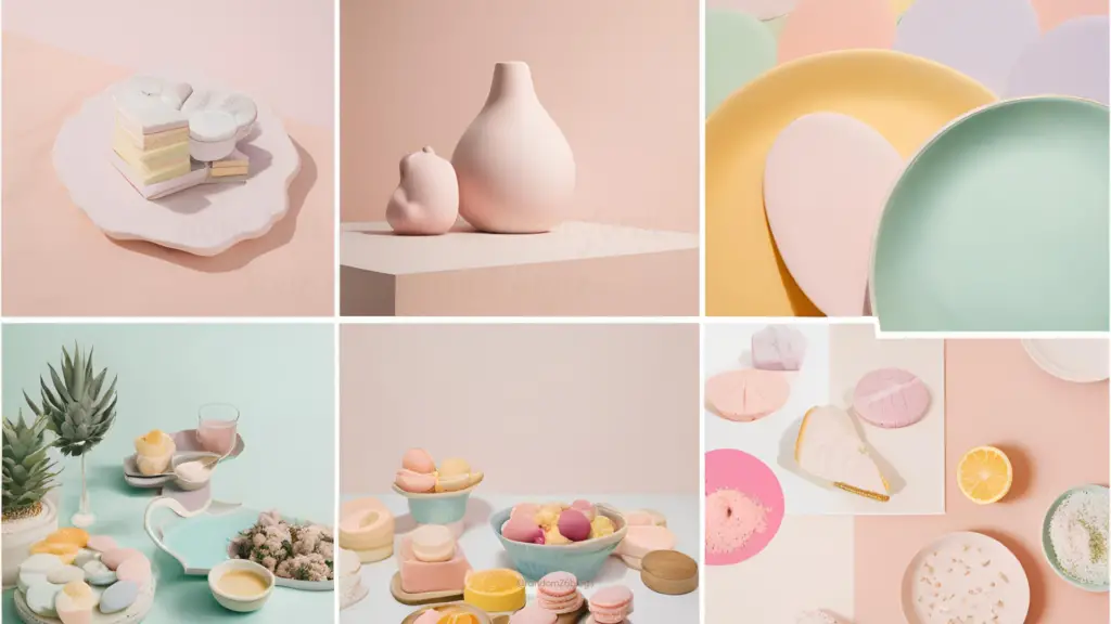
Pastels blend beautifully together. Picture a mural with mint green, baby blue, light grey, peach, and lavender. These colors create a soothing ambiance that draws people in, perhaps best admired for their desaturation.
What Are Pastel Colors?
Pastel colors are those with enough white mixed in to reduce saturation, creating pale versions of standard colors. Popular pastels include millennial pink, light azure, creamy mint, and whimsy yellow.
What Is a Pastel Color Palette?
A pastel color palette consists of complementary pastel shades used in home decor, fashion, photography, and more. We’ve curated 20 of the best pastel color schemes with their respective Hex codes for your inspiration.
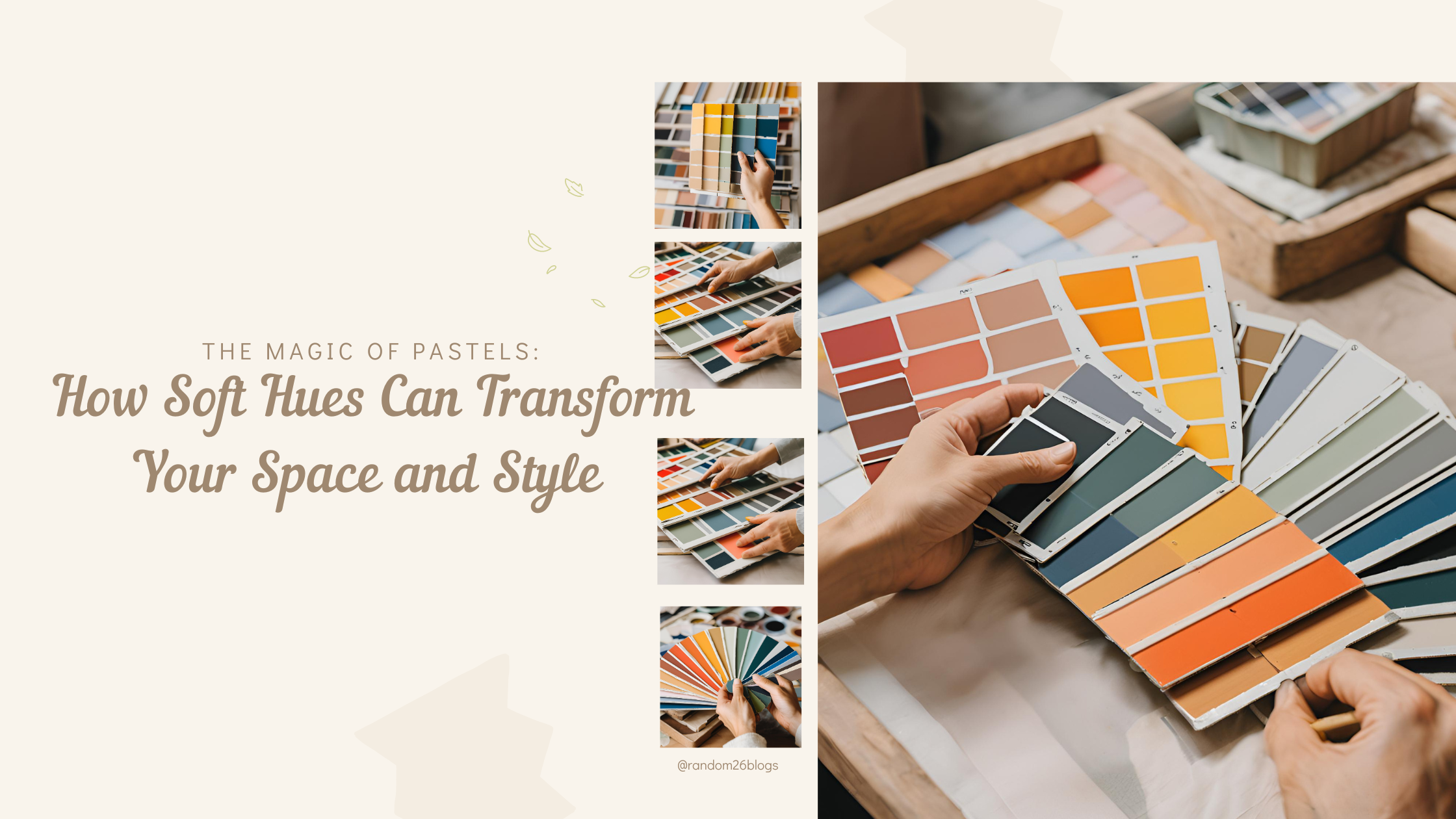
20 Best Pastel Color Schemes The Magic of Pastels: How Soft Hues Can Transform Your Space and Style
#1 – Candies Be Love A blend of soft pinks and blues, perfect for a cute cafe, bakery, or nursery.
- Yellow: #F7F6CF
- Pale Turquoise: #B6D8F2
- Linen: #F4CFDF
- Steel Blue: #5784BA
- Sky Blue: #9AC8EB
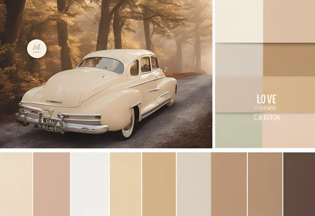
#2 – Love-caroon A warmer, sophisticated palette ideal for photo albums or Instagram themes.
- Pale Leaf: #CCD4BF
- Burly Wood: #E7CBA9
- Zinnwaldite: #EEBAB2
- Ecru White: #F5F3E7
- Vanilla Ice: #F5E2E4
#3 – Sugary-Colored Pills This palette features diluted bright colors suitable for kid-themed rooms, cafes, or teen product packaging.
- Azalea: #F5BFD2
- Jungle Mist: #E5DB9C
- Zombie: #D0BCAC
- Chatelle: #BEB4C5
- Tonys Pink: #E6A57E
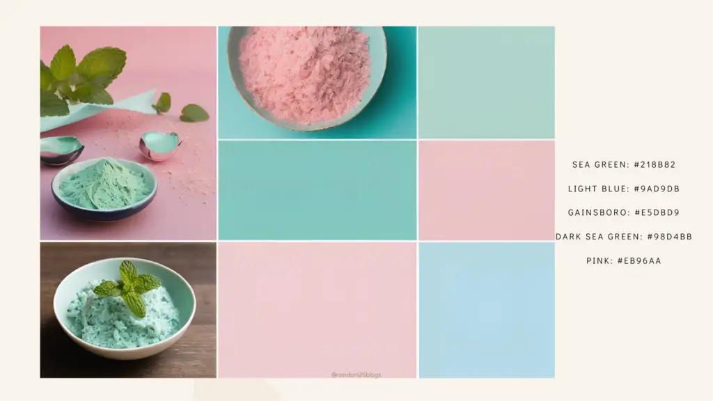
#4 – Mint to Be A mix of blue and pink for food or fashion blogs.
- Sea Green: #218B82
- Light Blue: #9AD9DB
- Gainsboro: #E5DBD9
- Dark Sea Green: #98D4BB
- Pink: #EB96AA
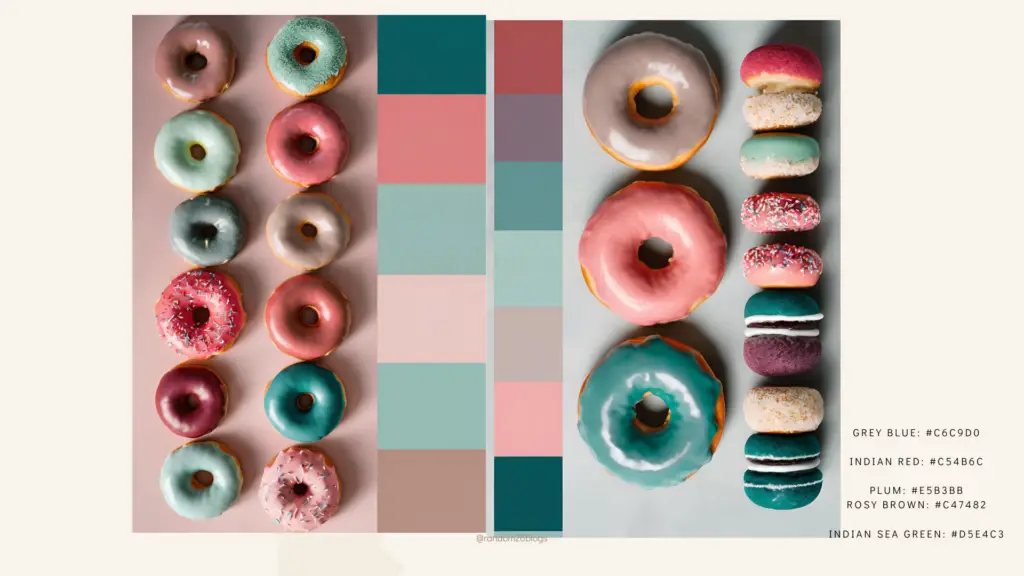
#5 – Donut Move Featuring pinks balanced by grey-blue and medium sea green, adding a cool touch.
- Grey Blue: #C6C9D0
- Indian Red: #C54B6C
- Plum: #E5B3BB
- Rosy Brown: #C47482
- Indian Sea Green: #D5E4C3
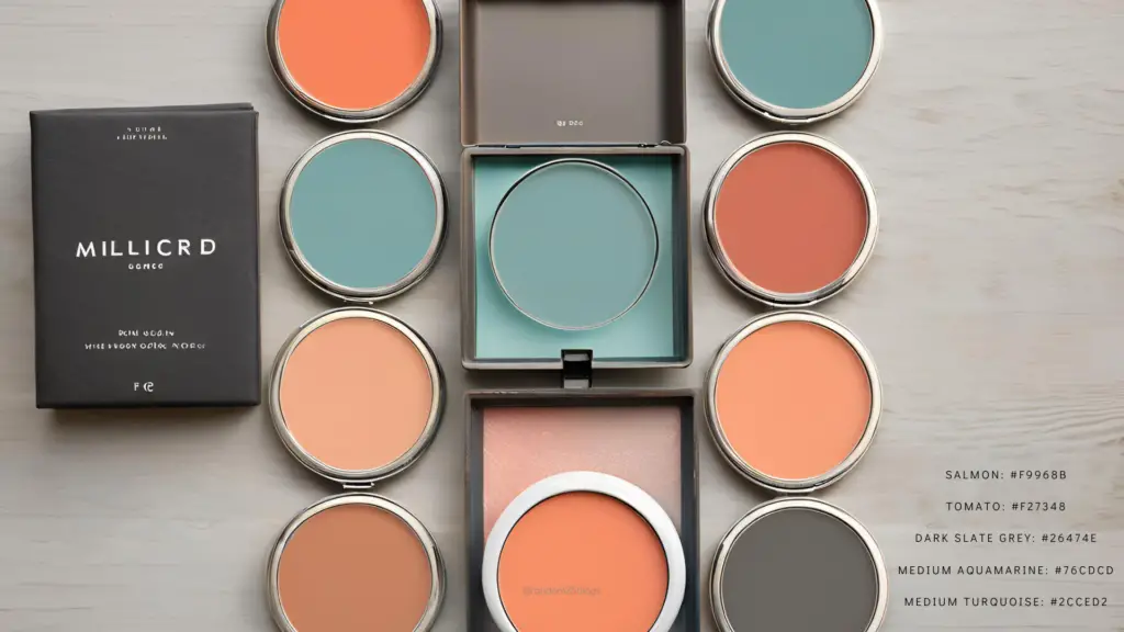
#6 – Fleeting Thoughts Inspired by TV shows like “Gilmore Girls,” this warmer palette is a bit spicier.
- Salmon: #F9968B
- Tomato: #F27348
- Dark Slate Grey: #26474E
- Medium Aquamarine: #76CDCD
- Medium Turquoise: #2CCED2
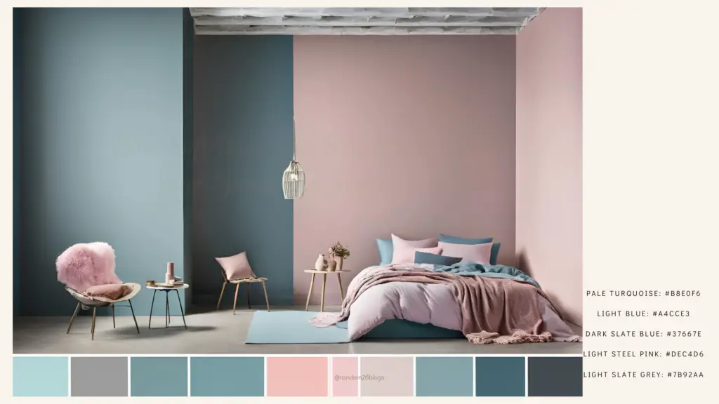
#7 – Fly Awe-way A blue-dominated palette suitable for apartments or offices.
- Pale Turquoise: #B8E0F6
- Light Blue: #A4CCE3
- Dark Slate Blue: #37667E
- Light Steel Pink: #DEC4D6
- Light Slate Grey: #7B92AA
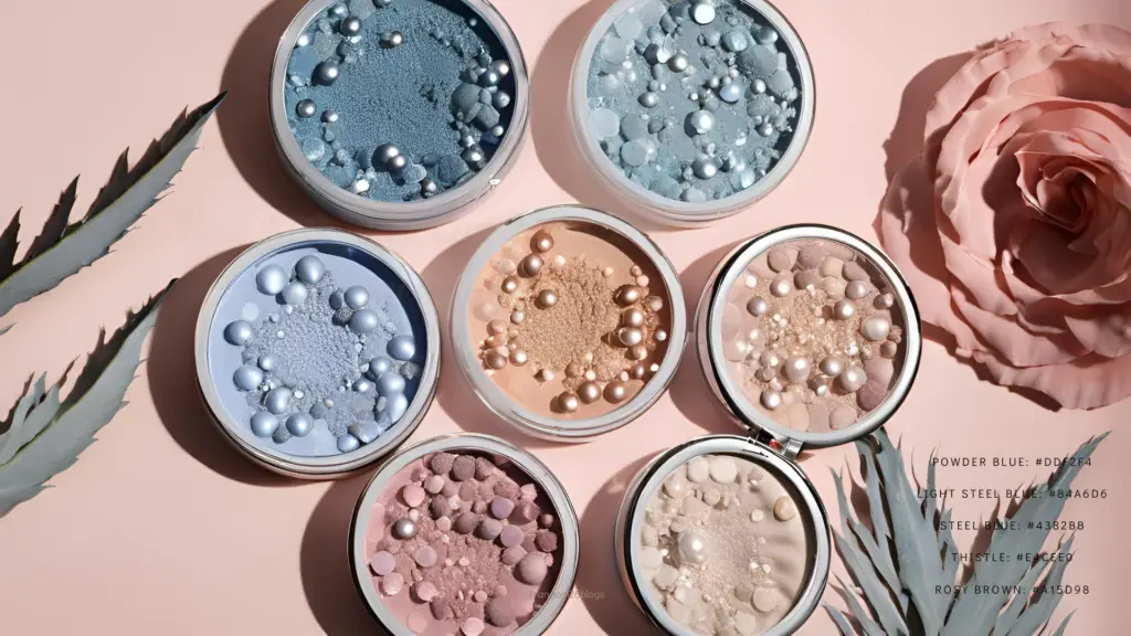
#8 – Crystallized Beauty Romantic tones of purple and pink, perfect for fashion Instagram pages.
- Powder Blue: #DDF2F4
- Light Steel Blue: #84A6D6
- Steel Blue: #4382BB
- Thistle: #E4CEE0
- Rosy Brown: #A15D98
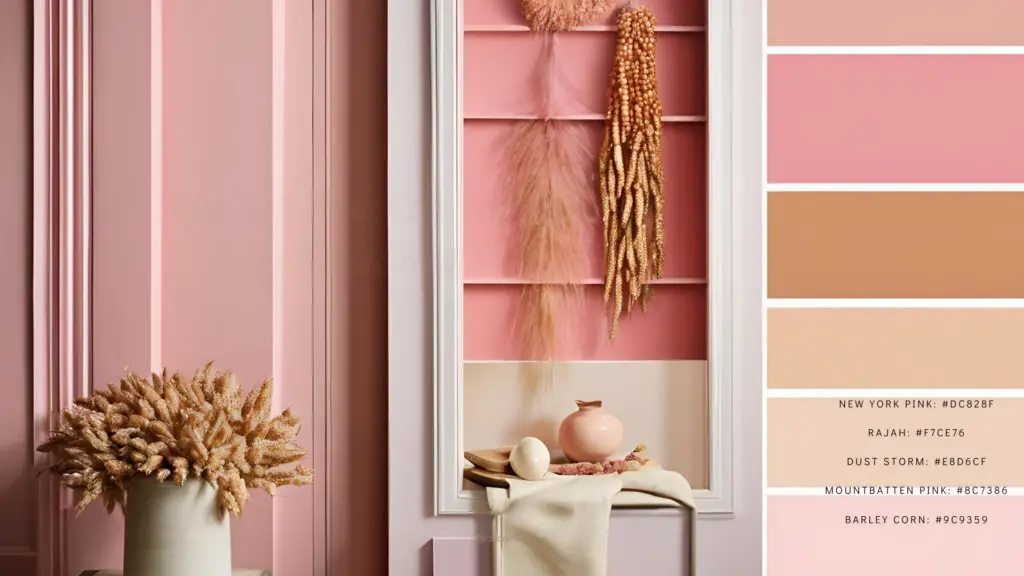
#9 – Ice See You Cream Rich fall colors, ideal for cozy homes, homestays, or villas.
- New York Pink: #DC828F
- Rajah: #F7CE76
- Dust Storm: #E8D6CF
- Mountbatten Pink: #8C7386
- Barley Corn: #9C9359
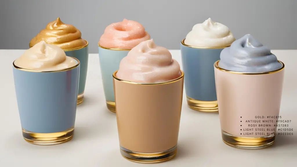
#10 – Sippin’ Sweet Similar to Donut Move but with a brighter, louder gold element.
- Gold: #F4C815
- Antique White: #F9CAD7
- Rosy Brown: #A57283
- Light Steel Blue: #C1D5DE
- Light Steel Blue: #DEEDE6
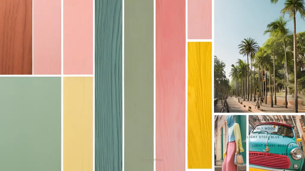
#11 – Mini Pastel Pops Common in travel pages on Instagram, balancing pink, yellow, and green.
- Indian Red: #E9BBB5
- Burly Wood: #E7CBA9
- Light Steel Blue: #AAD9CD
- Light Khaki: #E8D595
- Dark Sea Green: #8DA47E
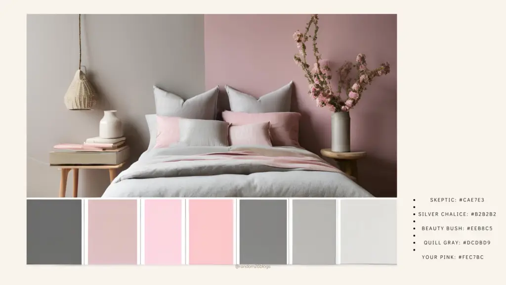
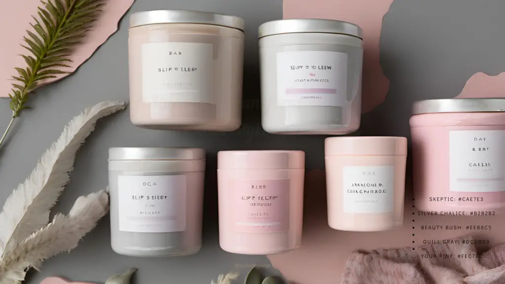
#12 – Slip to Sleep Calming colors suitable for adult bedrooms.
- Skeptic: #CAE7E3
- Silver Chalice: #B2B2B2
- Beauty Bush: #EEB8C5
- Quill Gray: #DCDBD9
- Your Pink: #FEC7BC
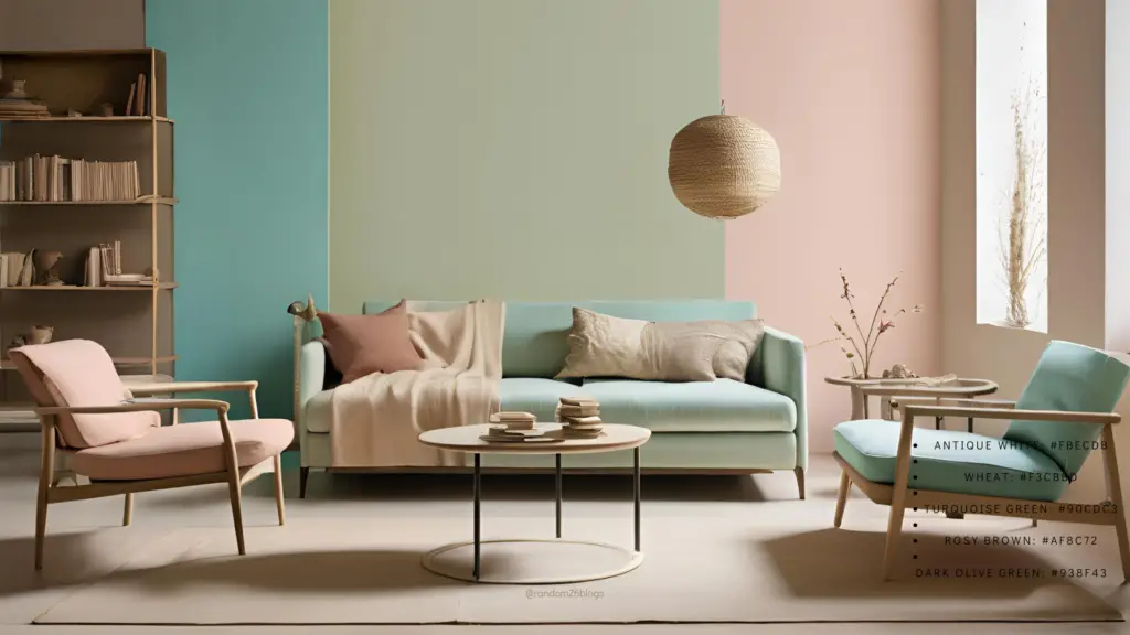
#13 – Minimalistic Fine Pastel Warmer colors adding character to living rooms or personal libraries.
- Antique White: #FBECDB
- Wheat: #F3CBBD
- Turquoise Green: #90CDC3
- Rosy Brown: #AF8C72
- Dark Olive Green: #938F43
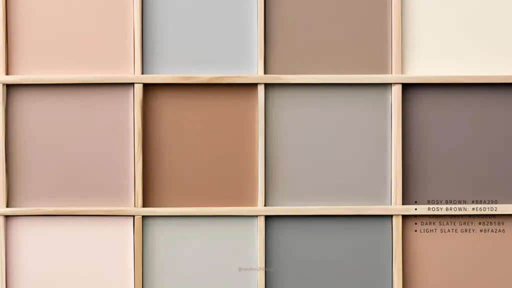
#14 – Wood You Pick Me Up? A more subdued palette for those hesitant about pastels.
- Rosy Brown: #B8A390
- Rosy Brown: #E6D1D2
- Light Grey: #DAD5D6
- Dark Slate Grey: #B2B5B9
- Light Slate Grey: #8FA2A6
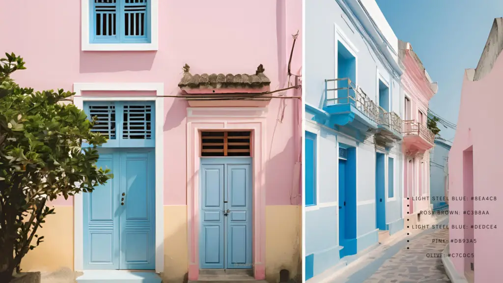
#15 – Way Back to Hue Evoking Greek streets with whitewashed houses and blue oceans.
- Light Steel Blue: #8EA4C8
- Rosy Brown: #C3B8AA
- Light Steel Blue: #DEDCE4
- Pink: #DB93A5
- Olive: #C7CDC5
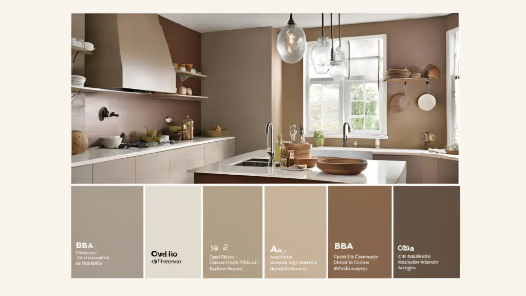
#16 – Shades of Us A mature palette for kitchens or bathrooms.
- Lynch: #698396
- Opal: #A9C8C0
- Brandy: #DBBC8E
- Del Rio: #AE8A8C
- Bali Hai: #7C98AB
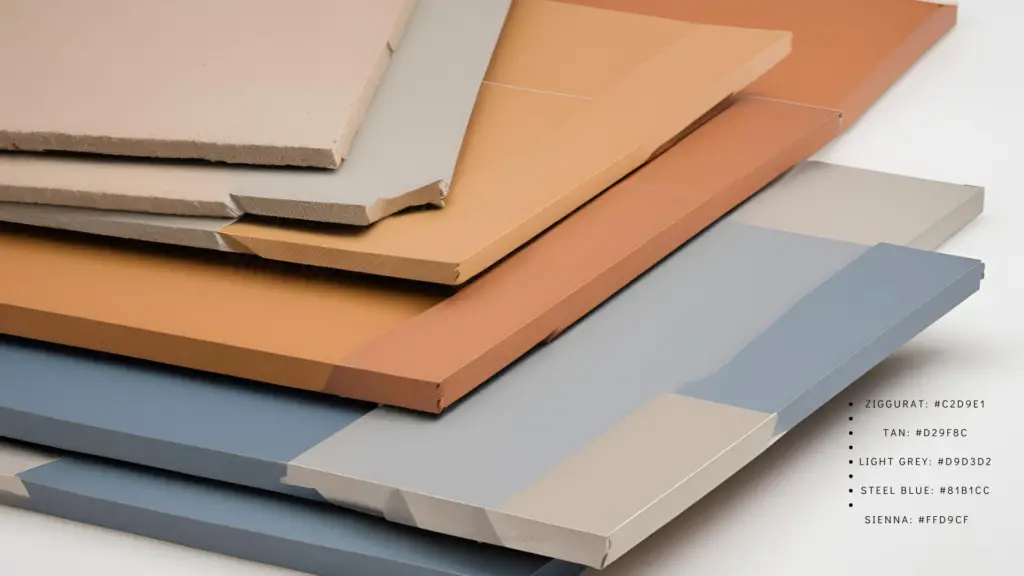
#17 – Anchoring Gates A balanced warm and cool palette for packaging and product design.
- Ziggurat: #C2D9E1
- Tan: #D29F8C
- Light Grey: #D9D3D2
- Steel Blue: #81B1CC
- Sienna: #FFD9CF
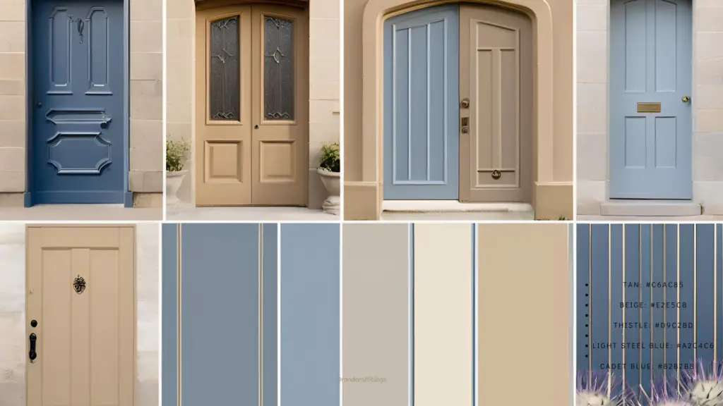
#18 – Lookin’ A(Door)able An understated theme of tan, beige, blue, and thistle, suitable for website design.
- Tan: #C6AC85
- Beige: #E2E5CB
- Thistle: #D9C2BD
- Light Steel Blue: #A2C4C6
- Cadet Blue: #82B2B8

#19 – The Road Less Travelled An elegant fall palette devoid of pinks and blues.
- Sienna: #874741
- Rosy Brown: #CA9C95
- Dim Grey: #40393E
- Gainsboro: #E5E4E5
- Gray: #897C87
#20 – 50 Shades of Feminism Combining feminine pinks with rebellious browns for a sophisticated scheme.
- Dark Olive Green: #46302B
- Dim Gray: #76504E
- Light Grey: #D3CCCA
- Rosy Brown: #A37E7E
- Gray: #86736C
FAQs: Pastel Color Palettes
Are pastel colors warm or cool? Pastels can be either warm or cool. Warmth is determined by the presence of orange, and coolness by the presence of blue.
What effects do pastel colors have on your audience? Pastels induce calmness, uplift moods like spring, renew romance, and add elegance. They’re versatile, beautiful, and boost moods.
Uses of Pastel Color Palettes
Branding: Brands like The Only Good and Zeithaus use pastels for a bold yet soft statement.
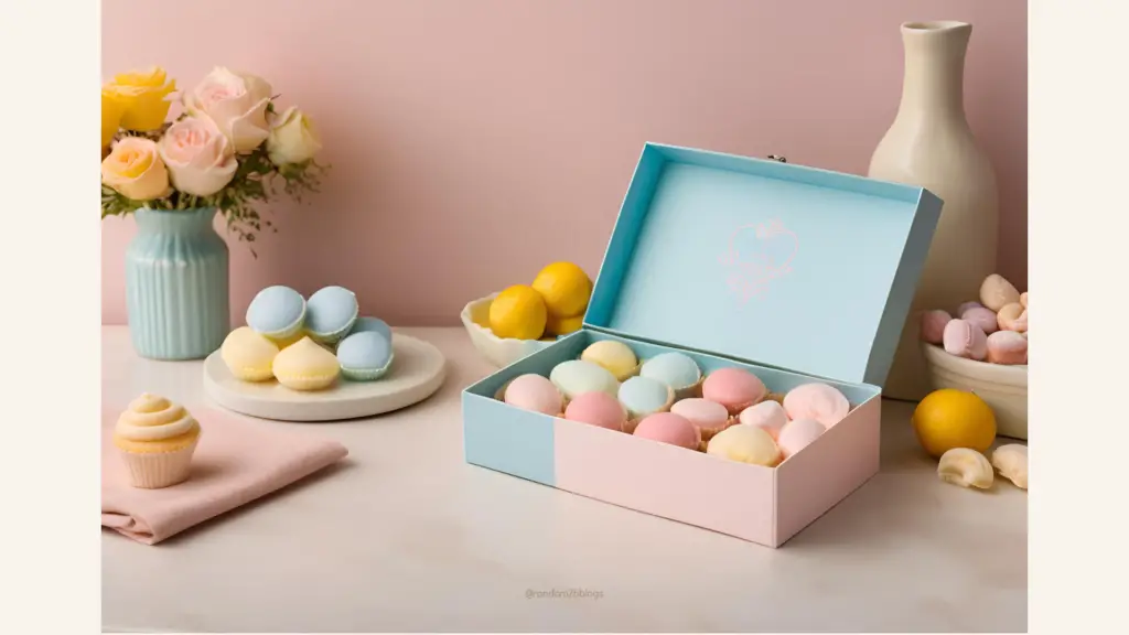
Photography: Photographers use pastels to create serene, surreal images.
Instagram: Pastel themes enhance Instagram feeds, popularized by movements like Candy Minimal.
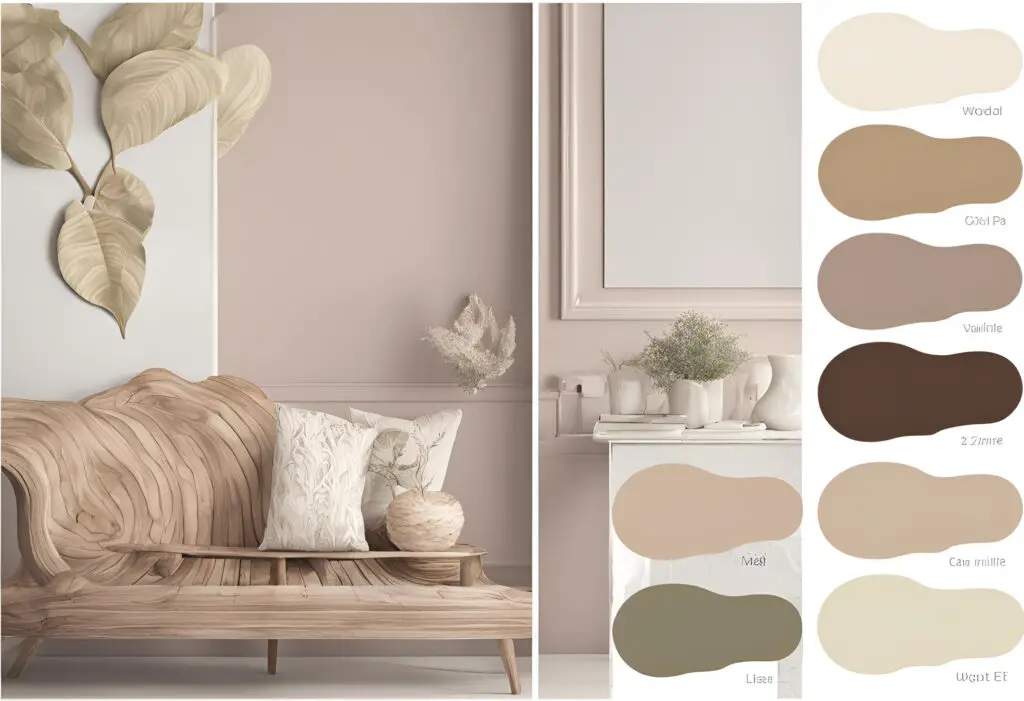
Interior Design: Pastels are becoming the new neutrals in home decor, adding calm and happy vibes.
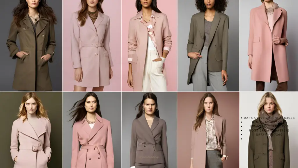
Fashion: Pastels are trending in fashion, seen in collections by designers like Marc Jacobs.
Website Design: Pastels can refine website aesthetics, making them pleasant to look at.
Benefits of a Pastel Color Palette
Pastels are aesthetically pleasing, mood-boosting, versatile, and add a contemporary feel. They’re trending in interior design, fashion, and web design.
Embrace pastels for their unique, calming, and uplifting qualities.
1 thought on “The Magic of Pastels: How Soft Hues Can Transform Your Space and Style”